Breaking Free From The Generic Finance Pack


The Brief
Joseph came to us with a challenge that’s all too common in the mortgage industry.
After founding his business in 2020 as ‘It’s Simple Finance’, he’d built a reputation that culminated in winning the MFAA 2025 Excellence in Customer Service award for NSW/ACT.
But the name was holding him back, SEO issues and generic positioning weren’t doing justice to his expertise with business owners, professionals, and investors.
He needed a rebrand that would reflect his unique approach. Something that projected strength and intelligence while maintaining the trust and peace of mind his clients valued.
The Challenge
The mortgage industry is flooded with generic branding that all looks the same. Most brokers default to predictable house icons, handshakes, and corporate palettes that do nothing to differentiate their expertise.
Joseph’s brief was refreshingly specific: he wanted something “strong and symbolic” that could evoke both power and peace. Think “hand of the king from Game of Thrones” meets “soft and peaceful like a robin.” Not your typical finance brief, but exactly the kind of strategic thinking that separates premium brokers from the pack.
The real challenge was creating an identity that would attract high-calibre clients while avoiding the boring feel of typical finance brands.
The Strategy
Sun Bear’s approach centred on the concept of the strategic predator: intelligent, powerful, but ultimately peaceful. We explored bird symbolism as a way to communicate both strength and serenity, developing two distinct concepts that tackled Joseph’s brief from different angles.
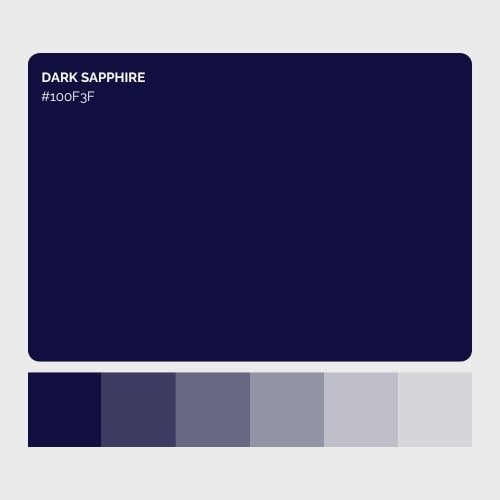
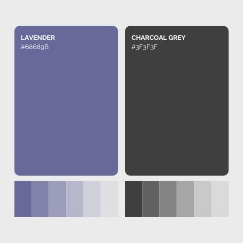
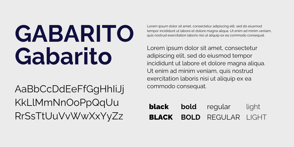
Our colour palette of deep navy, charcoal, and lavender created sophistication without falling into the corporate tones trap. The typography choice of Gabarito added modern confidence while maintaining approachability.
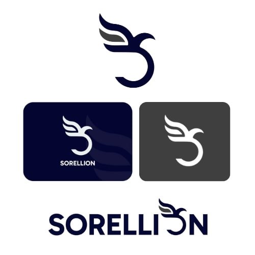
Each concept was designed to work as both a standalone mark and integrated wordmark, giving Sorellion maximum flexibility across applications.
Concept One
This design captures the “relentless strength and strategic intelligence” Joseph wanted. The sharp, flowing forms create a powerful bird of prey silhouette while cleverly integrating both ‘S’ and ‘O’ letterforms. It’s a mark that says “I’m the broker who gets deals done” without shouting about it.

Concept Two
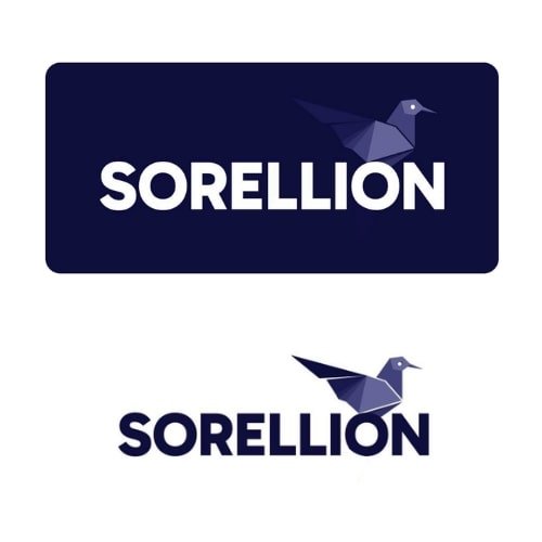
Taking a more geometric approach, this stylised bird symbolises both precision and peace. The origami-inspired shapes convey clarity and intentionality, while the calm confidence of the upright posture aligns perfectly with Joseph’s award-winning customer service approach.
The Result
Both concepts solved the core challenge: creating a sophisticated identity that attracts serious clients while maintaining the trust and peace of mind that drives referrals in the mortgage space.
The rebrand positioned Sorellion not just as another mortgage broker, but as the strategic partner that business owners, professionals, and investors choose when they want expertise, not just rates.
