When Emmet decided to leave his successful career at Savvy Business to start Good Shepherd Business Brokers, he wasn’t just changing jobs – he was answering a calling. After four successful years helping business owners navigate exits, Emmet had a vision for something different.
He wanted to specialise in Queensland’s larger business sales, particularly those complex business and freehold packages that require both commercial property expertise and deep business acumen. His unique background spanning business brokerage and real estate positioned him perfectly for this niche.
But launching a new brokerage in an established market meant he needed an identity that would immediately communicate his philosophy: being the trusted guide who leads business owners safely through the most important transition of their lives.
The Challenge
The business brokerage industry is crowded with generic messaging and corporate imagery that fails to capture the deeply personal nature of selling a business. Most brokers position themselves around transactions and numbers, missing the emotional reality that for many owners, their business represents decades of blood, sweat, and tears.
Emmet’s challenge was twofold: differentiate himself in a market full of established players while communicating his unique value proposition – that he’s not just a broker, but a strategic shepherd guiding clients to their ideal retirement.
The name “Good Shepherd” was intentional, drawing from the powerful metaphor of protection, guidance, and leadership. But how do you translate that concept into a visual identity that works in the professional B2B world?
The Strategy
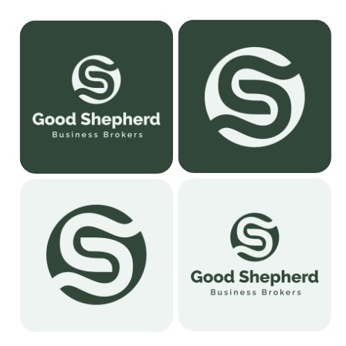
Sun Bear’s approach centred on the shepherd’s staff as the perfect visual metaphor. Just as a shepherd uses their staff to guide and protect their flock, Emmet guides business owners through critical transitions with expertise and care.
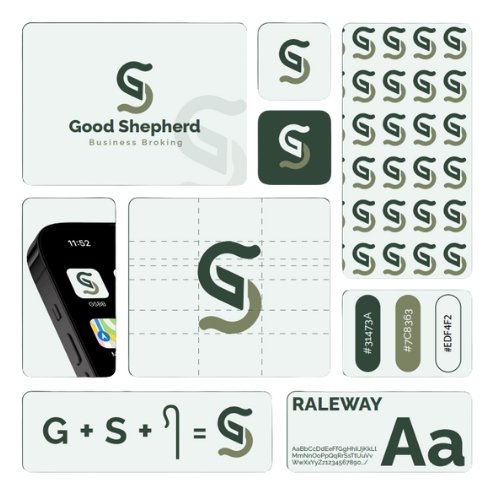
The challenge was integrating this symbol with his business initials “GS” to create a mark that was both memorable and meaningful. Our solution layered the shepherd’s staff concept into the letterforms themselves, creating a dual-purpose design that works as both symbol and monogram.
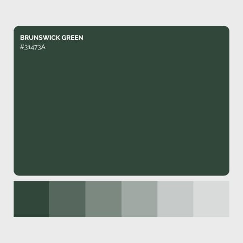
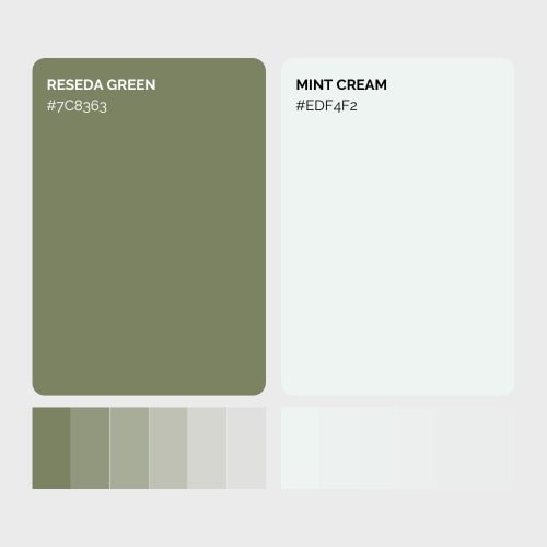
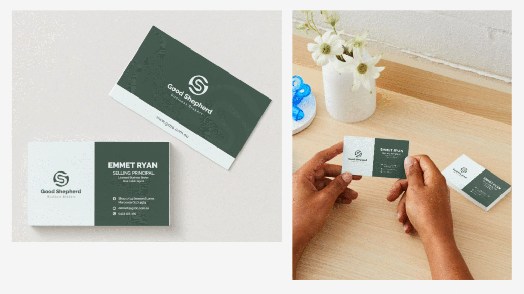
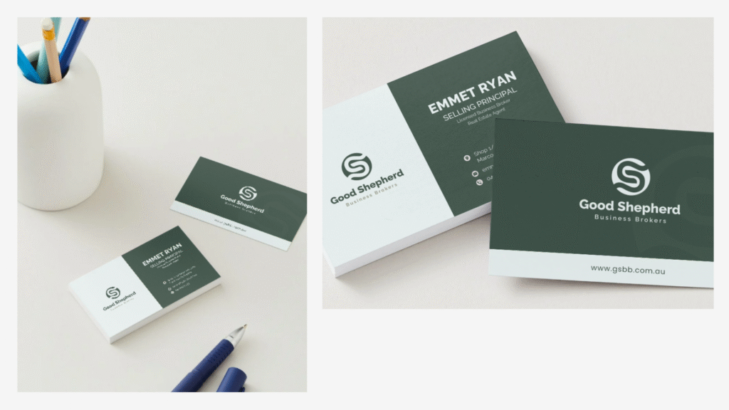
The colour palette of deep Brunswick Green and warm Reseda Green evokes trustworthiness and grounded expertise, while the mint cream provides clean contrast. Raleway typography adds modern confidence while maintaining approachability – perfect for someone who needs to connect with both retiring business owners and ambitious buyers.
Concept One
This design wraps the shepherd’s staff within a circular form, suggesting both protection and completeness. The flowing integration of the “G” and “S” creates a cohesive mark that reads as guidance and security. It’s a logo that says “your business journey ends safely here.”
Concept Two
Taking a more geometric approach, this concept strips away the circular containment for a cleaner, more clinical execution. The sharp, defined edges and precise letterform construction create a sophisticated mark that emphasizes professionalism and precision. This version communicates the same guidance philosophy through a more structured, business-focused lens.
The Result
Both concepts solved the core challenge: creating a sophisticated business identity that honours the deeply personal nature of business transitions, while positioning Good Shepherd as the strategic choice for Queensland’s most valuable business and property packages.
The identity positions Emmet not just as another business broker, but as the trusted guide that successful business owners choose when they’re ready to move to greener pastures.