Hai approached Sun Bear with a clear vision for Ace Capital Lending: create an asset finance business that embodies the qualities too often missing in the industry – being a high achiever, punctual, sophisticated, and prompt.
As an asset finance business covering vehicles, equipment, personal loans, and business loans, Ace Capital needed an identity that would immediately communicate their commitment to speed and excellence in a market where clients often feel frustrated by slow processes and bureaucratic delays.
The brief was refreshingly direct: avoid the clichéd finance imagery (shields, animals, ace of spades) and create something modern and innovative that would appeal to anyone needing fast, reliable financing solutions.
The Challenge
The asset finance industry has a reputation problem. Clients expect lengthy approval processes, mountains of paperwork, and weeks of waiting for decisions. Most lenders look and feel the same – corporate, slow, and bureaucratic.
Andrew’s challenge was positioning Ace Capital as the antithesis of this experience. How do you visually communicate speed, precision, and sophistication in an industry dominated by generic corporate imagery?
The name “Ace Capital” suggested excellence and winning, but translating that into a mark that felt innovative rather than predictable required careful consideration. Hai’s teal colour preference pointed toward something fresh and modern, distinct from the typical finance tones.
The Strategy
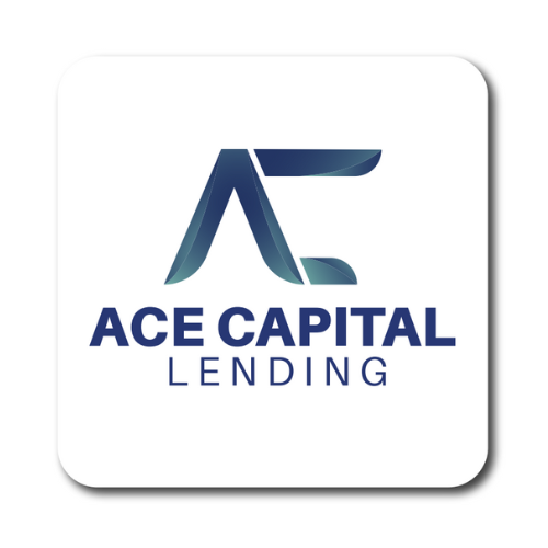
Sun Bear’s approach focused on the concept of dynamic fusion – bringing together the Ace Capital initials “A” and “C” to create marks that suggested movement, progress, and seamless integration. Both concepts explored how these letters could work together to communicate the brand’s core promise: accelerated capital solutions.
The gradient palette of Midnight Teal to Aqua Mist created a sense of flow and innovation, while Aileron typography added technical precision without feeling cold. Each concept was designed to feel premium and forward-thinking, perfect for a lender that promises to move at the speed of business.
Concept One
This design fuses the “A” and “C” into a geometric symbol that communicates upward momentum and stability in equal measure. The sharp angles suggest precision and decisiveness, while the horizontal balance adds the reliability clients need in financial partnerships. It’s a mark that says “we move fast, but we’re built to last.”
Concept Two
This logo features a bold, rounded fusion of the letters
“A” and “C” the initials of “Ace Capital”, forming a
strong brand monogram.
The circular flow between the letters represents continuity,
financial motion, and trust in capital lending.
Smooth curves bring an approachable tone, while the
clean symmetry adds professionalism and modernity.
The subtle gradient enhances depth and innovation,
aligning with the brand’s forward-thinking identity.
Overall, this mark feels confident, scalable, and
iconic a perfect fit for a results-driven finance
company.
The Result
Both concepts solved the core challenge: creating a sophisticated financial identity that breaks away from industry stereotypes while communicating speed, precision, and reliability.
The designs position Ace Capital not as just another lender, but as the innovative choice for clients who refuse to accept “that’s how finance works” as an answer. Whether it’s equipment financing or business loans, the identity promises the same thing: exceptional service delivered at the speed of opportunity.